NM.org Continuous Improvement
ROLE
UX Research / Design
SCOPE
Research · Strategy · UX · Design
PLATFORM
Responsive Website
AUDIENCE
Patients & Medical Staff
Turning a relaunched website into a continuously improving experience

Northwestern Medicine relaunched NM.org with a major rebrand - but launching was just the start. The next question was whether the new experience actually worked for patients trying to find care.
Northwestern Medicine had invested significantly in redesigning NM.org from the ground up. The rebrand brought a new visual identity and restructured digital presence, but it created an immediate need: validate whether the most important patient journeys - finding a doctor, finding a location, researching care options, and scheduling - were meeting user needs. No formal usability testing infrastructure existed for the site. The work called for building one from scratch and making it repeatable.


NM.org before redesign - a fragmented web presence
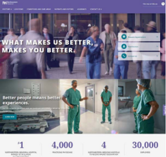

NM.org after redesign - unified experience
Before the redesign, NM.org was a sprawling, inconsistent digital footprint: 250+ individual websites, 6,800+ pages of content with no coherent strategy, limited mobile presence, and navigation built around internal org structure rather than patient needs. The relaunch consolidated that into a single, unified org experience.
Building a user testing infrastructure from the ground up
With no existing testing framework in place, the first task was defining how research would work at scale - not just for one test, but across an ongoing roadmap. This meant identifying the right patient journeys to prioritize, selecting methodologies that would yield both behavioral and attitudinal signal, and establishing a rhythm that cross-functional teams could actually act on. Collaboration spanned marketing, product, engineering, clinical, and operations stakeholders throughout.
-
Mapped end-to-end patient journeys — find a doctor, find a location, research care, schedule — to identify where to test first and why
-
Designed and launched A/B tests using VWO, writing hypotheses and structuring experiments around known friction points in each journey
-
Deployed heatmaps and visitor recordings to surface behavioral patterns across key page types and flow stages
-
Collected qualitative signal through on-site user feedback, capturing patient language and unmet needs alongside quantitative data

Mapping a yearlong testing strategy
The journeys were breaking in predictable, fixable ways
Testing revealed that friction wasn't scattered - it concentrated at specific decision points in each journey. Patients were getting confused about which CTA to use, stalling when search results felt irrelevant, and hitting dead ends on mobile. End-to-end testing made patterns visible that page-level analysis had never surfaced. The homepage heatmaps alone told two different stories depending on how patients arrived, making a strong case for a more contextual experience.

Heatmaps from VWO helped identify current usage and testing opportunities

Appointments landing page insights and test recommendations

Doctor profile page A/B test findings and recommendations
Every test connected back to a patient action
Design decisions were driven by what the data made undeniable, and scoped tightly to changes that would move a specific patient action — a call placed, an appointment requested, a doctor found. Each test was designed with a clear hypothesis, a measurable primary KPI, and a recommendation the organization could act on. The result wasn't just a series of test wins — it was a repeatable methodology and a continuous improvement plan internal teams could sustain.

-
Redesigned the Find Locations CTA on service line pages — the variation produced 37% more CTA clicks without affecting appointment or doctor page metrics, proving context-specific CTAs outperform generic ones

-
Tested phone number placement and label on location detail pages — the "Call Number Button" variation produced the strongest combined conversion across clicks-to-call and appointment request clicks

-
Identified homepage CTA placement as a high-leverage opportunity — moving CTAs into the hero image produced an anticipated lift of ~986 additional appointment request clicks per month on desktop
Results
Small changes made big impacts in helping patients find the information they needed
37% lift
in Find Locations CTA clicks from service line pages — without disrupting doctor or appointment metrics
~986 / mo
anticipated additional appointment request clicks on desktop from homepage CTA placement change
540 + 995
estimated monthly lift in clicks-to-call and appointment request clicks from location page mobile test
First testing framework
built from scratch — a repeatable methodology and yearlong roadmap the organization could sustain and act on